


Jay runs the UK’s largest specialist fencing installer for large infrastructure projects. They deliver highly-regulated fencing for highways, rail, aviation and maximum-security locations.
Jay wanted to cut down on spreadsheets and paper within the business to make life easier for his staff. And get more work done in the process.
We helped Jay by creating a business management portal for his large team.
- Company-wide portal
- Timesheets, daily forms, health & safety
- HR and finance systems
- ...and more
What could we do for you?
Before Switchplane...
Jay was like you.
His business was growing and the team’s spreadsheets were becoming a nightmare to manage. The purchase order spreadsheet in particular was holding so much data that it was slow to load. And even when it did, it was prone to manual errors and inconsistencies.
Elsewhere in the business, other processes were also under strain. Managers were losing their Mondays processing weekly fencer timesheets. Training and holiday requests were paper-based. Invoices needed manual sorting.
Jay did consider off-the-shelf solutions. But there was nothing that suited the company. Jay knew that he had to find a system that worked for all departments. Custom software fitted the bill. Something built to suit everyone's needs and get rid of those troublesome spreadsheets.
So he got in touch with Switchplane.
Working with us
We built what Jay wanted.
We tackled Jay’s top pain points head-on. First of all, purchase orders.
We created an automated solution for their purchase orders with easily-searchable suppliers. This removed loads of manual checking and processing. The system now sends a direct email with a PDF to the supplier following approval. Easy.
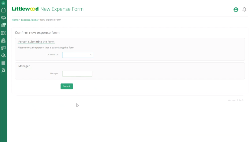
Then we started to look at the equally long-winded invoice approvals process. This workflow could take weeks. We built an automated system that reduced approval time to hours. The system reads a PDF from an email and matches it to whoever created the original purchase order. It goes to their queue, gets approved, then goes to the finance team ready for payment. Sorted.
Jay then saw opportunities for further growth of the platform across the business. Other teams started to see the benefits and wanted a piece of the action too.
Enter: a whole business portal for all staff.
Time-consuming timesheets made easy
No more 5am starts for managers.
Before, timesheets were a headache for managers. They’d receive them via text, as a photo of a timesheet, or through notes on paper over the weekend. For the finance team to be able to do their thing, this meant 5am starts on a Monday to reconcile it all. Who needs that?
We made it easy for them with a mobile-friendly area for fencers to use whilst on site. They record the work completed, sign off their day’s work, and submit it to their manager. The manager can then review and approve the digital timesheets, ready for the payment run.
Managers regain three hours of sleep and start the week without a headache. That’s a clear win.
The whole company, reachable from one screen
We've centralised everything they need.
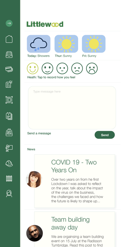
The Littlewood Fencing team were soon logging into the portal on a daily basis to complete their work. Jay decided that this could become an ideal central dashboard to get messages to his staff… and more.
We developed a useful, multipurpose dashboard as home to all things Littlewood Fencing. A news feed for notices, a hub for company documents, feedback and advice areas. A company poll for whole team input, a contact directory, plus a mood checker for wellbeing.
Result: easy communications and a 93% positive response to the dashboard from the team.
All areas of the business, tackled one-by-one
To save Jay and his staff time
Following our usual process with Jay, we look at the next priorities and areas to improve, focusing on ROI.
Notifications to speed up completion of tasks? Tick.
Onboarding tours to demo new functionality across the team? Tick.
Finance approval queues? Tick.
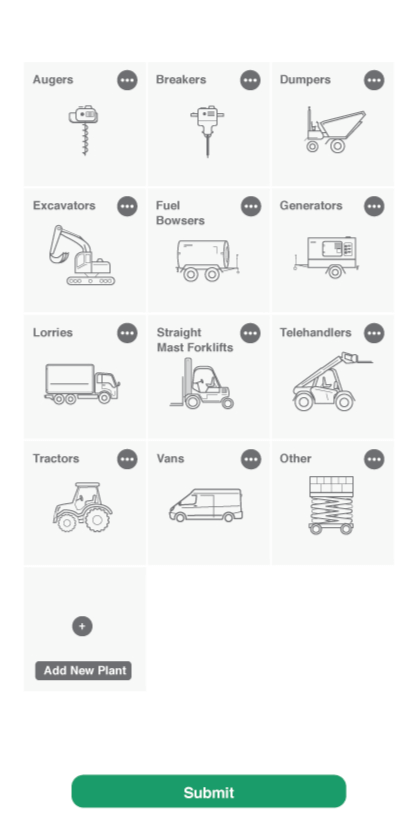
HAVS assessment forms? Tick.
HR system with training, absence and leave management? Tick.
User privileges flexible to suit every individual’s job role? Tick.
We have developed a system that works for every area of the business and saves everyone time.
Now, how can we help you?
Are you like Jay?
We can help save you and your staff time. We can free up valuable hours through automation and allow you to focus on what really matters.
hey!
We build custom software with your team, for your team. Our apps and web platforms bring about meaningful change for businesses across the UK.